Tuesday, December 15, 2009
Class Reflection
One of the strongest aspects of the class were the lectures. Both Professor Anderson and Professor Lucas brought their individual strengths and backgrounds to each lecture. They knew exactly when to take a step back and let the other one shine when the topic at hand fit more into their specialty. However, when it was appropriate they did an excellent job of team teaching and never seemed to step on one another's toes.
With any class that centers around technology that is constantly changing and evolving by the hands of a large percent of the living population, and maybe some of the non-living, you run the risk of miscommunication and conflicting understandings of how these things work. In this course, information was being funneled through multiple sources before it got down to the students. Anderson and Lucas have their respective departments and knowledge base, and that is funneled down into three seperate section leaders each with THEIR own profession and field of interest which is then once again funneled to us. On top of that each of our section leaders were learning different aspects of the material, at times simultaneously with us, which made it difficult at times to truly explore the subject matter since we didn't have a readily accesible "brain to pick" who had a thourough knowledge of our material. As a result I believe that some of our work may have seem stunted and just short of a real success.
But in no way do I mean to say that this class wasn't successful. I know that I learned alot not only in my lecture, but in my section as well thanks to my section leader. Her expertise in the field of documentary film making always shone through and it was that sort of unique talent that each of the professors involved in the class had that have made it such an invaluable experience.
Bottom line, I'm looking forward to Media 160.
Tuesday, December 1, 2009
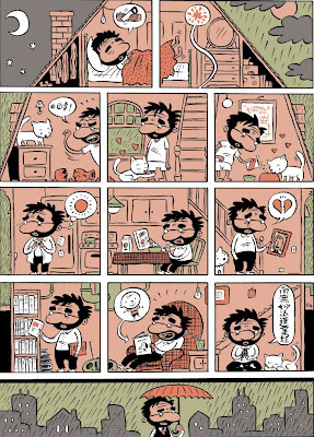
Ivan Brunetti, Page from Schizo #3
 The layout of a page is the most important thing that a cartoonist has to think about when making a comic. The page draws you in, each of the panels direct your eye to one another and even the space in between the panels can imply the passage of time or unseen and unheard actions.
 A contemporary cartoonist who recognizes this fact in spades is Ivan Brunetti. Brunetti’s comics, whether long form or single panel, always carry with it a hefty knowledge of graphic design and visual literacy. This example of a page from one of his large print single issues is a great example of Brunetti’s skill in graphic design.
Here we have a single page depicting a stand alone story. Immediately we are drawn in by the wholeness of the page in that it is a single image of a house broken up into individual panels. Even the form and placement of the house, the weather, the time of day and its physical orientation are preserved within this single image.
Deeper still the panels themselves are separate yet at certain points conjoin to create a whole image. However, even in these instances the passage of time still exists. By using two or more panels to convey a single image, we create the illusion of time passing within our heads and allow ourselves to take in a more fluid “movie-like” image. In a lot of ways this technique is directly related to persistence of vision and other visual phenomena, in that it fools its viewers into seeing movement and progression where there really is not.
The pacing of each of the panels is made so that the mundane activities he is going through are taken in evenly and as rigidly as possible. It is here that the cartoonist controls the viewer’s eye and guides them into reading the work that they’ve created in their intended way.
Thursday, November 12, 2009
Videodrome

The plot revolves around a TV executive named Max Renn played by James Woods who discovers a new type of programming for his network that has just the edge he had been looking for, snuff television. Picked up from a Malaysian broadcast, the program known as Videodrome depicts anonymous victims being tortured and murdered on camera and Renn is tasked with broadcasting this program on his station. Hilarity ensues.
The mood of this film is carried primarily by stylistic lighting effects. In the majority of scenes there is a strong frontal light that mimics that of a television set in a dark room. In these scenes the central characters immersion in the depraved television show is emphasized and we are forced to focus on the characters descent into a state of near madness. These scenes tend to completely mask any traditional sort of lighting, leading one to believe that none of it is used at all.
In other scenes the lighting takes on a typical TV set style of lighting. A great deal of fill and key lighting, with the room almost completely flooded with light. These scenes act as a stark contrast to the ones that involve Renn's degradation and remind us of the split in reality that is occuring for the main character. Additionally, this lighting style reminds us of the medium that is being criticized and commented upon in this film.
Tuesday, October 20, 2009
Museum of the Moving Image Trip
It got off to a good start with our wonderful tour guide. She struck me right away as friendly and approachable, which is important when you're required to follow someone around for an hour.
We were treated to a number of interesting optical toys, all fun to play around with. While the appropriate age level for most of these things did seem to be particularly low, our guide's acknowledgment of this made everyone feel a little better about playing around with cut out animals.
The most interesting thing that I got out of the visit was the explanation of the Foley artist. I had no idea what this job entailed before hand, despite seeing it all the time in the credits for movies. Once I learned what it was, I started listening to the sounds around me and thinking of the strange and unexpected things they could be made to stand in for. On a few occasions I started thinking what it was about certain sounds that scared me or made me laugh.
I've been to the Museum of the Moving Image a few times before and seeing that its always interesting and informative, I'll definitely be going again in the near future.
